Key skills
Prototyping + Interaction Design
Visual Design
Tools Used
Figma
Platfrom
Mobile (iOS/Android)
Problem
Many mobile jewelry sites feel cluttered or annoying to use. I wanted to design an experience that was fast, image-driven, and free from distractions—without losing personality.
Competitive Analysis & Research
I analyzed three main competitors: Enroute Jewelry, Vivienne Westwood, and Urban Outfitters. Enroute had great social media presence and clean UI, but too many pop-ups and oversized images. Vivienne Westwood was clean and minimal but lacked color and felt cold. Urban Outfitters was fun and immersive but sometimes unclear on product availability.
These insights helped me define what to keep simple and what to improve.
Reflection
Designing Urbangem helped me grow tremendously in both UX and UI design. I learned that simplicity is powerful—especially on mobile—and that usability should always support the brand story. Figma’s auto-layout and component system were essential for maintaining consistency across the project, and user testing reminded me of the value of outside perspective in catching things I might overlook.
If I had more time, I’d love to explore additional features like personalized product suggestions, a loyalty rewards section, or integration with social media for customers to tag and share how they style their pieces. Overall, this project helped me connect the dots between research, design systems, storytelling, and creating a real user journey.
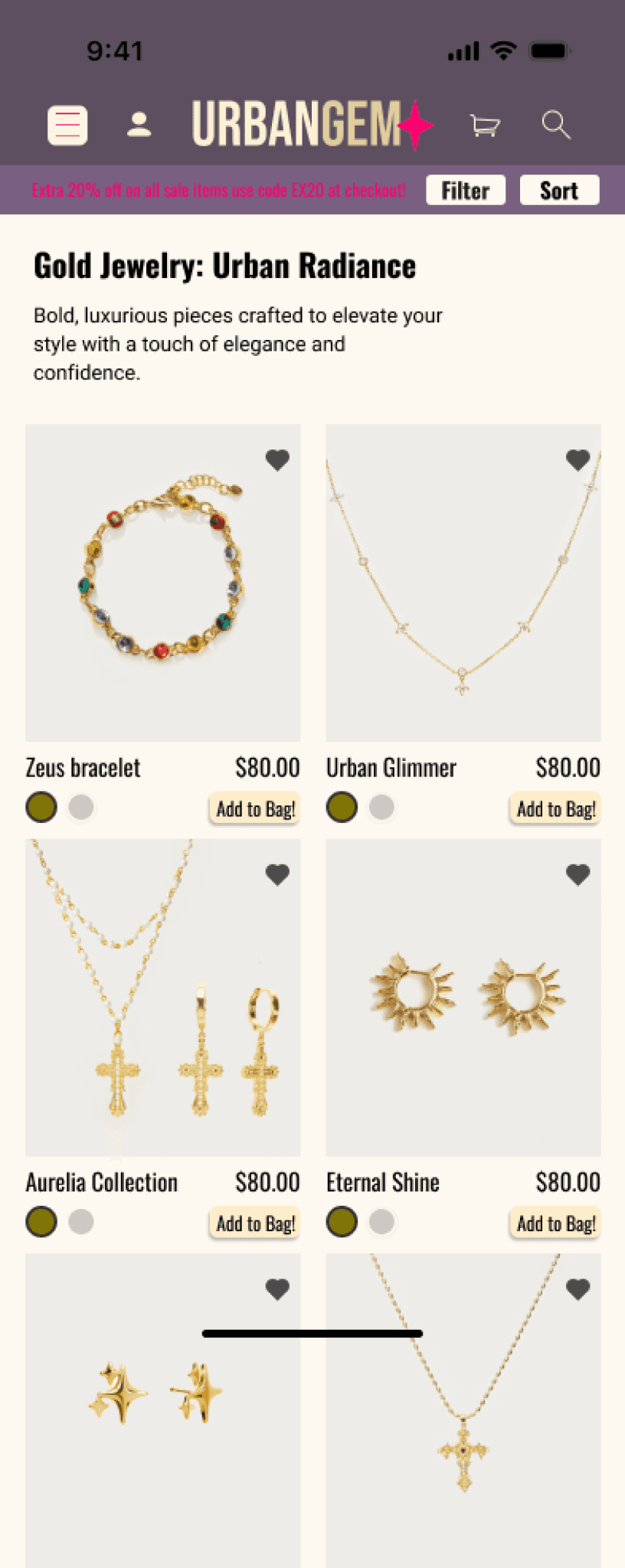
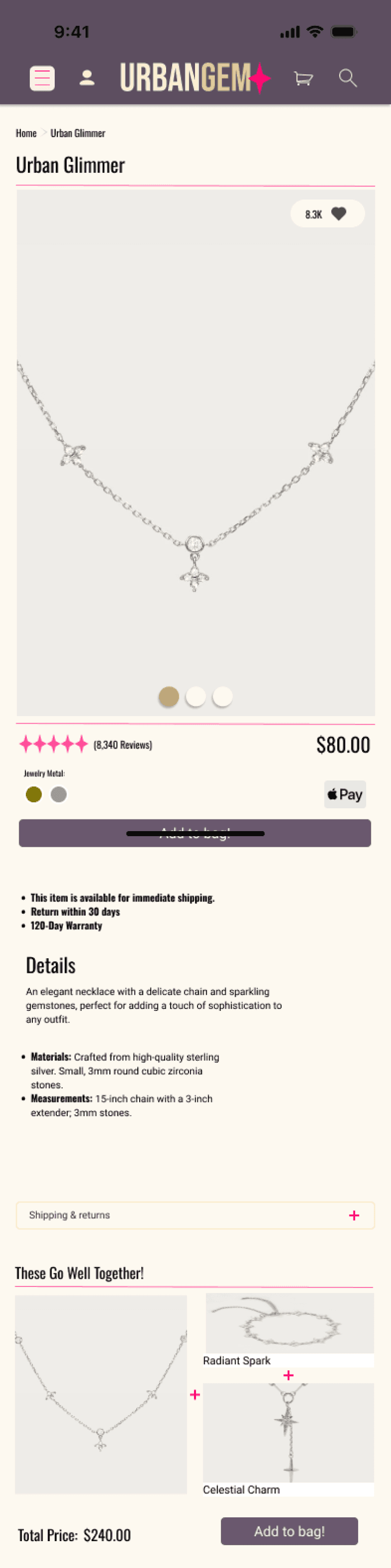
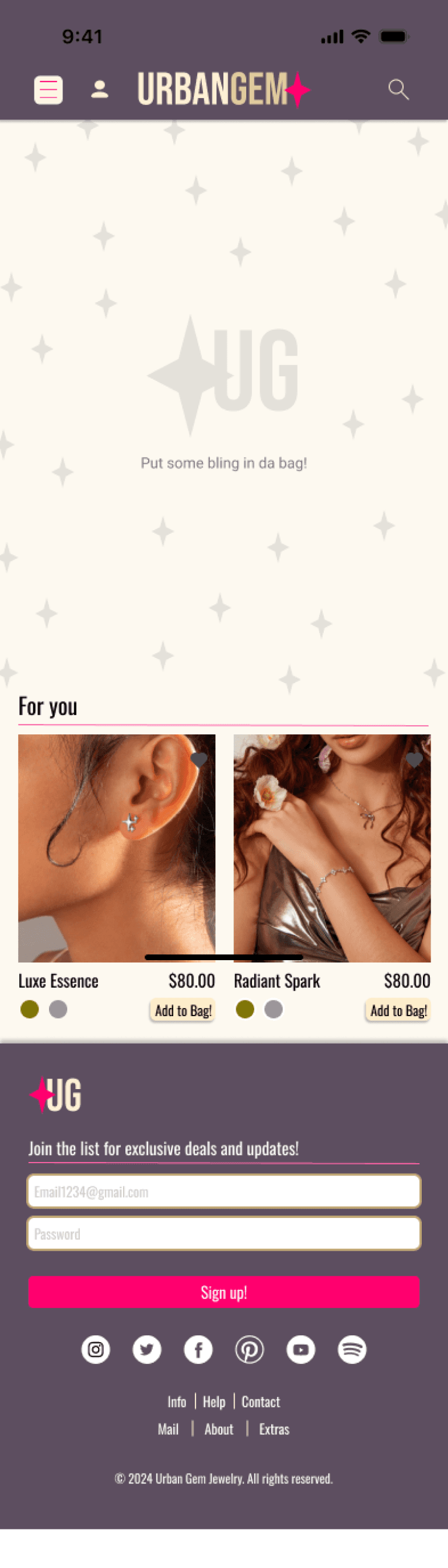
Wireframes & Planning
Before diving into UI design, I created low- and mid-fidelity wireframes using Figma. These wireframes laid out the structure for key pages, including the loading screen, homepage, category listings, product detail pages, shopping cart, and checkout flow. Each screen was built with usability in mind, following a mobile-first approach that prioritized clarity and ease of use.
Planning the user flow helped me visualize how a customer would navigate from entry to purchase. These wireframes also made it easier to identify where interactions like filtering, saving items, and applying promo codes would occur within the layout.

SCHOOL PROJECT - Oct–Nov 2024
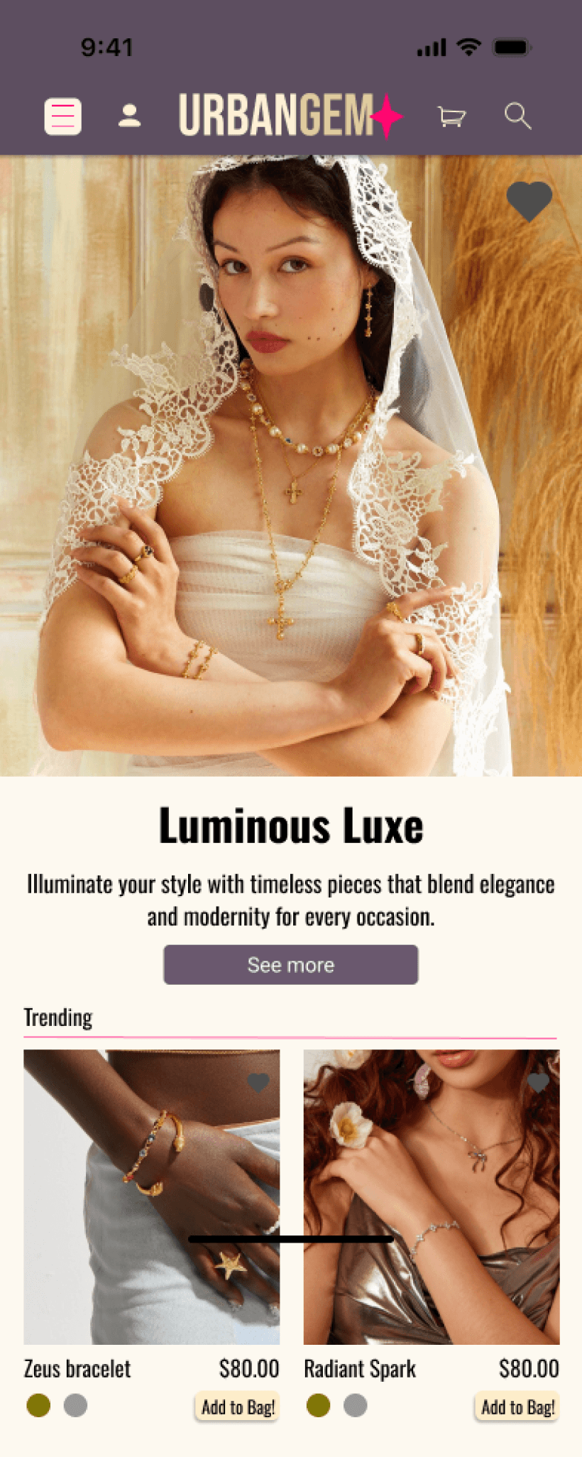
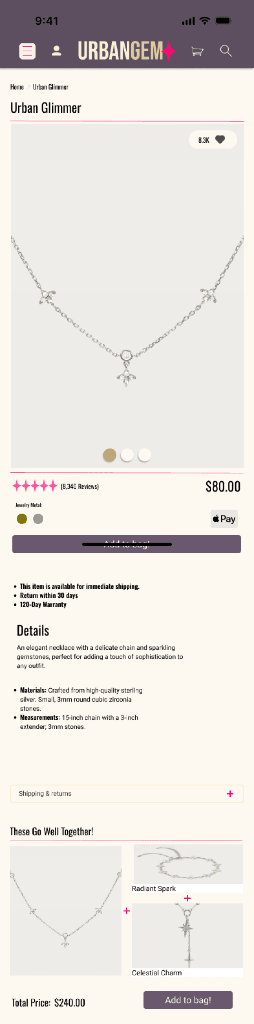
Urbangem


Target Audience
Urbangem is designed for a younger, fashion-forward audience—primarily individuals in their late teens to early 30s who are expressive, diverse, and interested in jewelry that speaks to their style. The shop is completely unisex, and the visual tone is urban, sleek, and inclusive.

Taylor Smith
“Style is my language, and storytelling is my power.”
About
Taylor Smith is an influential fashion creative and digital strategist currently working on Google’s marketing team. Known for her effortless elegance and powerful presence, Taylor has cultivated a loyal online following by sharing her passion for fashion, self-expression, and professional empowerment. Balancing corporate ambition with creative freedom can be a challenge, but Taylor thrives at the intersection of innovation, style, and storytelling.
Demographic
Personality
Innovative
Confident
Charismatic
Current Feeling
Empowered
Inspired
Slightly Pressured
Habits
Fashion journaling
Morning affirmations
Pain Points & Frustrations
Managing time
Keeping up with fast-moving trends
Pressure to maintain a curated image
Goals & Needs
Elevate her brand while staying authentic
Grow her fashion influence across platforms
Build a fashion-tech mentorship community for young women
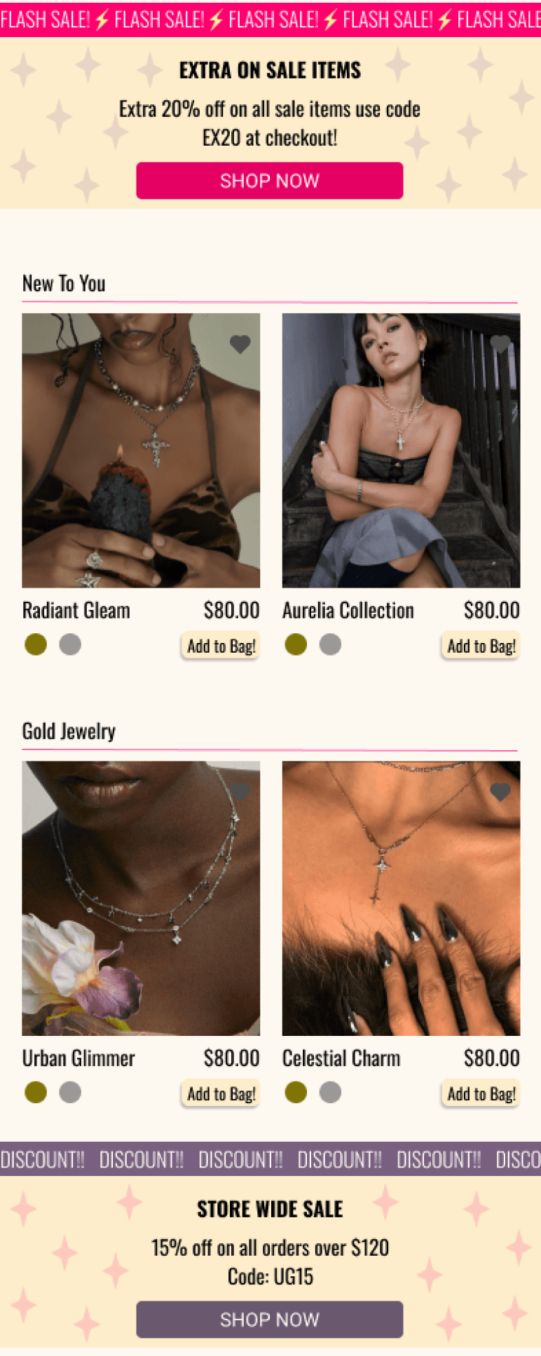
High-Fidelity Design & Prototype
Once the layout was solid, I began building high-fidelity mockups in Figma. I developed a consistent design system that included urban-inspired colors (black, cream, plum and subtle gold accents), bold but clean typography, and rounded, touch-friendly components. My goal was to keep the site energetic and modern without losing simplicity.
The final screens included an animation, a homepage with featured drops, category browsing pages, detailed product pages with user reviews and variations, and a straightforward, secure checkout flow. Every screen was designed using auto-layout and components.


I also built a clickable prototype directly in Figma. I improved spacing on product pages, clarified action buttons, and streamlined the checkout experience to make it faster and more intuitive. Based off feedback from peers and my professor.
Check out my other projects!