Problem
Natalia Kasperovich of Bricks for Better Brains needed a website that was accessible, professional, and easy to manage—especially for an older audience. Natalia had no previous digital presence, so we were tasked with building a fully functional, branded site from the ground up that could grow with the organization.
My Role
As one of three team members on this capstone project, I was actively involved in every stage of the design and development process. Our team evenly divided responsibilities. I focused primarily on UI/UX design, helping develop wireframes and high-fidelity mockups in Figma, also working on the front-end development. I was also involved in creating documentation for the client to support future site maintenance. Throughout the project, we maintained close collaboration, regularly checking in, offering feedback, and making group decisions to ensure a cohesive final product.
Research
We focused heavily on accessibility and usability for older adults. Research covered font sizing, high contrast UI, and large clickable elements. We studied guidelines like WCAG and design strategies for seniors to make sure our solution was user-friendly, visually clear, and functional across all devices. We also explored lightweight CMS platforms and hosting services that would allow the client to manage the site without any coding.
Reflection
Working on Bricks for Better Brains helped me grow significantly as both a designer and developer. I learned how to create a user experience that’s not only functional but also accessible and inclusive—especially for an older audience. Designing with clarity and simplicity taught me how powerful thoughtful UX decisions can be. Using Figma’s auto-layout and component system made it easier to stay consistent across pages and devices. Collaborating with a real client pushed me to think about long-term maintainability, and documenting the project for handoff helped me understand how important clarity is for both users and future developers.
If we had more time, I’d love to explore additional features like voice accessibility or guided tutorials that could also enhance usability for seniors with different cognitive or physical needs. These additions would help build a stronger sense of connection and engagement between B4BB and its users. Overall, this project helped me connect the dots between research, accessibility, design systems, and real-world storytelling through thoughtful user experience.
Target Audience
Our primary users were older adults engaging with cognitive health activities, along with caregivers, educators, and community organizers. The website had to be friendly, intuitive, and legible—while also professional enough to represent a growing initiative. We also considered the client as a user, making sure the editing system would be simple and stress-free.
Current Feelings
Excited, Calm, Joyful
Personality
Gentle
Determined
Adventurous
Pain Points
When websites are too cluttered, which confused me where to go
When text or icons is too small to read, so the bigger the better
Having trouble clicking buttons, when they are smaller, it is frustrating
Needs
Engage with supportive environment to learn
Find a mentor that understands my struggles
Can easily access information without a problem
Goals
Improve memory and brain health
Learn about senior friendly programs
Do something creative with my hands
Who am I?
I am a retired senior with two grandchildren. I was a housewife for the majority of my life, raising my children, and supporting my husband. My husband died a few years ago, and I have been looking to do something useful with my time and engage with community.
Details
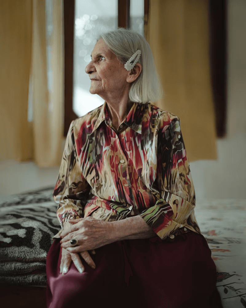
Maggie Smith
“A website that leads me
to community and empowers me to keep growing as a person,
no matter my age.”
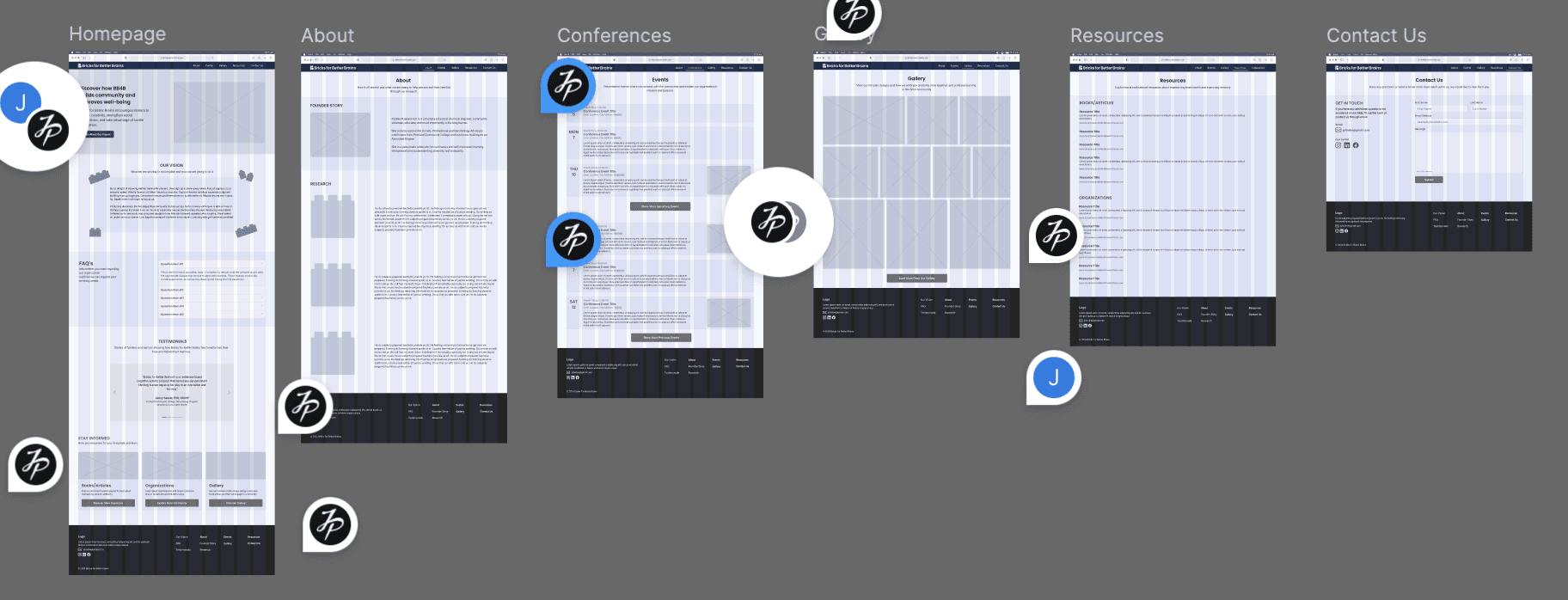
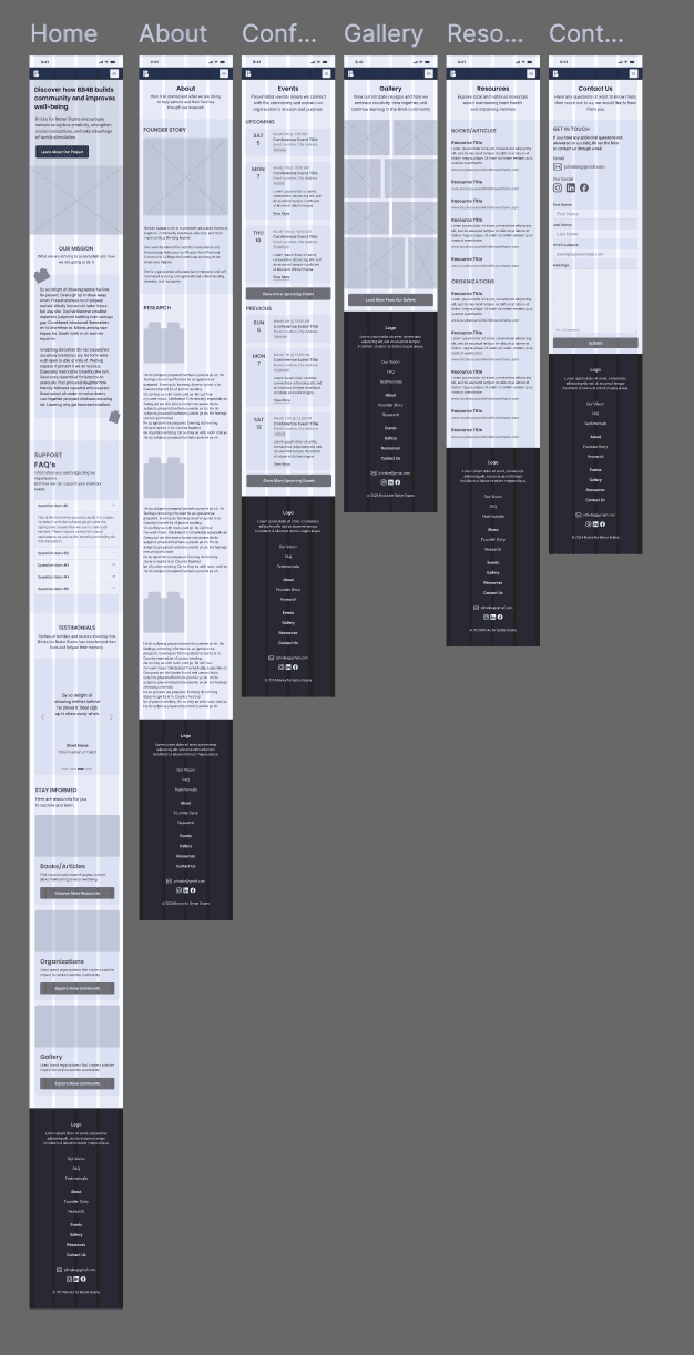
High-Fidelity Design & Prototype
Once the structure was finalized, we moved into high-fidelity mockups. The UI used a clean layout with large text, strong contrast, and simple icons for clarity. We carried the brand across all screens using a cohesive color scheme, custom illustrations, and modular components. The designs were fully responsive, adapting seamlessly between desktop and mobile devices.
The final screens included a homepage a resource page for activity guides and articles, and a contact page. Each screen was designed using Figma’s auto-layout and components to ensure consistency, responsiveness, and ease of updates.


We created a clickable prototype directly in Figma to simulate real user interactions across desktop and mobile. Based on feedback from our peers and advisor, we refined the spacing for improved readability, adjusted button sizes for accessibility.
Check out my other projects!
Key skills
Prototyping + Interaction Design
Visual Design + Front-End Coding
Tools Used
Figma, HTML/CSS, JavaScript, PHP
Team
Alexandra Eitelberg, Julianna Rodriguez
Platfrom
Responsive Website
Wireframes & Planning
We started by building low-fidelity wireframes in Figma to plan the layout and user flow across key pages: the homepage, resource page, and contact page. The wireframes focused on clear structure, simplified navigation, and accessible spacing for older users. These early layouts helped us test ideas quickly and share our progress with the client before applying visual styling. We also got great feedback from our Professor through creating these wireframes.
CAPSTONE PROJECT - Fall 2024 – Spring 2025
Bricks For Better Brains

